Torched at 2: Talks, toasts, and treats April 20-24
You can join for one event or meet up with me every single day for five days in a row
You can join for one event or meet up with me every single day for five days in a row

It's a public bathroom, yes, but it's really a piece of infrastructure that unlocks access to the city

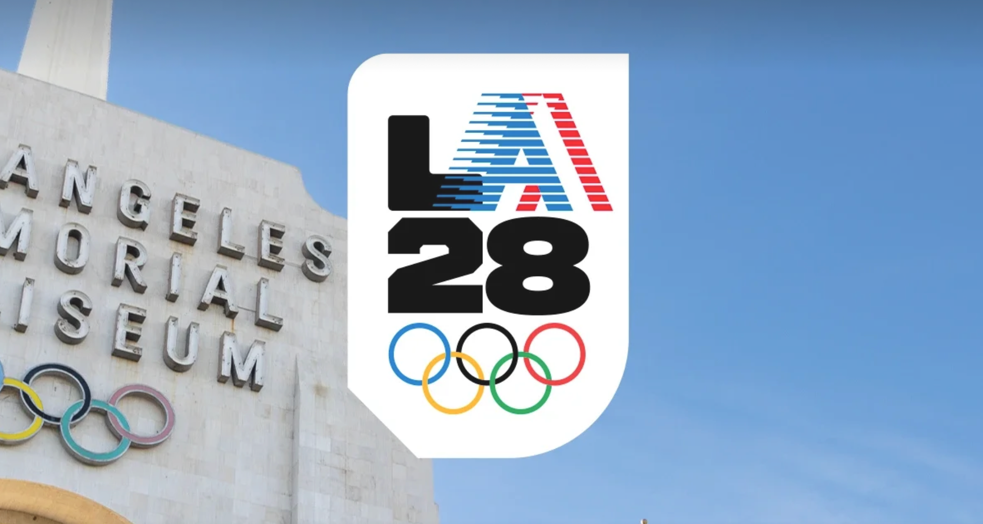
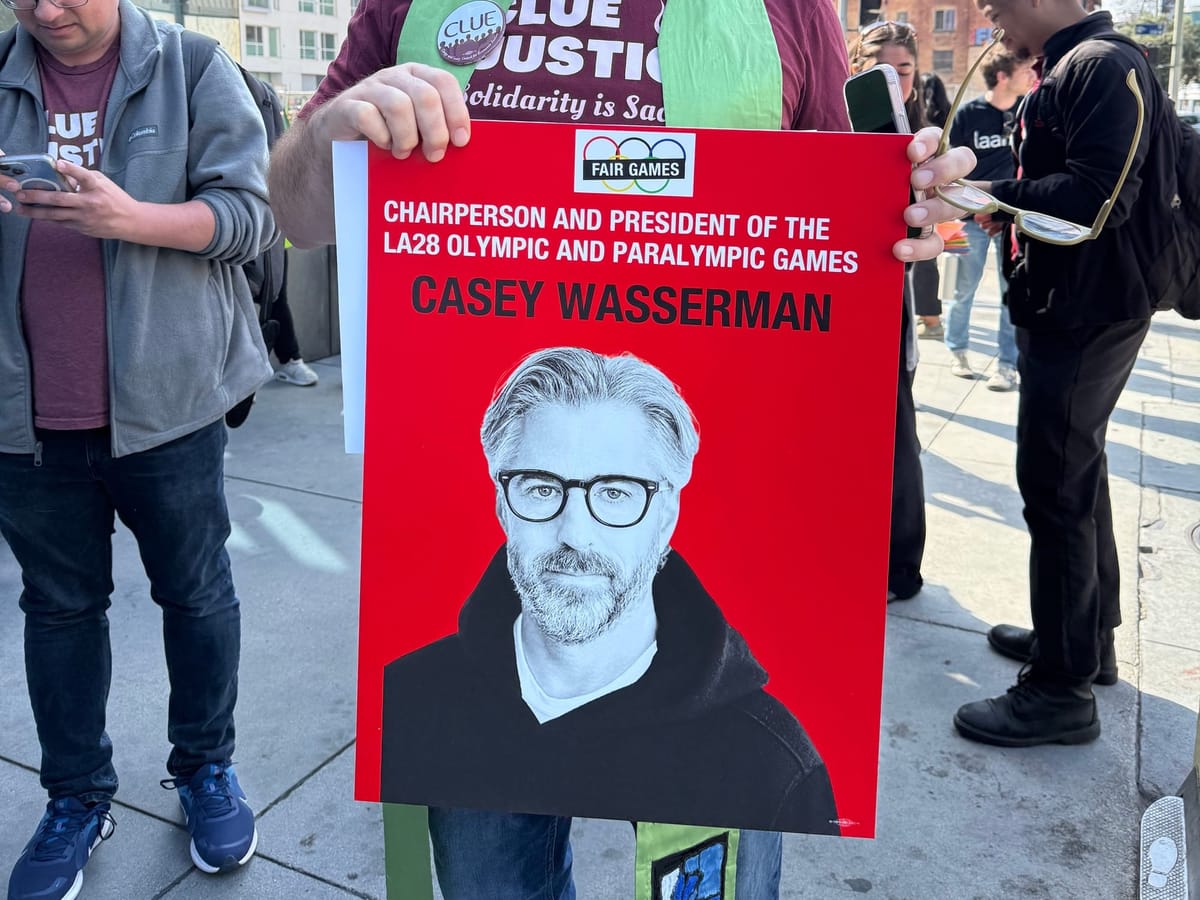
With NBC executing the official Kate Hudson handoff and Casey Wasserman apparently digging his heels in as chair, the world is closely watching as Los Angeles attempts a smooth transition to 2028. Now, finally, we can turn our attention to the most critical megaevent problem plaguing our city. And, of course, I'm talking about the LA28 logo.
With the lengthening lead between bid and games, the identities for the Olympics are unveiled so far out that they become a relic of another time. Debuting in 2020, an astonishing eight years ahead of the opening ceremonies, the LA28 logo is a holdover from a completely different design era. Just to give you an idea of the very specific cultural moment in which this concept was birthed, the part of the LA28 website with all the logo information still includes QR codes touting an accompanying augmented reality "Snapchat experience."
We are a community of inspired individuals and fearless dreamers. It’s time we made our mark. #LA28 #LA28Creator pic.twitter.com/XagKkA5d9a
— LA28 (@LA28) September 1, 2020
I've written about logos for two decades and there are three truths when it comes to Olympic and Paralympic logos in particular: 1) these announcements always summon widespread derision from the public, 2) the controversy tends to die down before the games themselves, and 3) they're all actually bad in their own way so the bar is very low.
But once I show you the problems with the LA28 logo, this information will haunt you for the next two years as you see these graphics spattered across the city.
Let's begin with LA28's explanation of what, exactly, is happening here:
Don Draper voice: "So, technically, there is no LA28 logo"
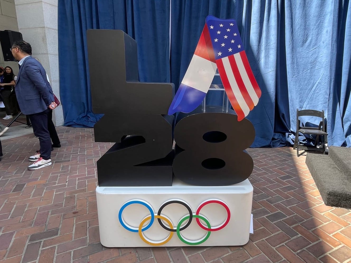
"The LA28 emblem was built for the digital age with a dynamic and animated 'A' that is always evolving in its journey to the 2028 Olympic and Paralympic Games," according to LA28. There are over 50 "emblems" from "creators," which include a lot of athletes but also artists like Steven Harrington and Alex Israel, and then also Reese Witherspoon, for some reason? Snoop Dogg has his own, of course. (I mean, why even have a mascot at this point; just make the LA28 Snoop Dogg toys.) There are also genre-specific emblems: spray-painted "street art," "unshakeable optimism" that taunts our seismic vulnerability, "camo" for military, the Paris-to-LA handover design (which looks like a tent), and "retro" which plays on the 1984 Stars in Motion logo, yet doesn't try to turn the 'A' into a star; instead it makes a very bad knockoff American Airlines logo.
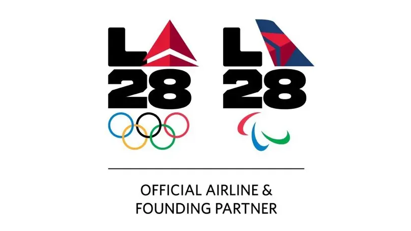
More are being added all the time, like for the launch of the volunteer program. And the sponsors also have their own: NBC, Delta, Visa, Ralph Lauren, which puts the commercialism front and center in a very icky way.
But here's something I've been pondering for the last five years. If you're going through all the trouble to create what I assume will be hundreds of logos by the time the games roll around, why would you not brand LA28 using 'LA' as a customized emblem? Why is it only the 'A' that changes out?
I didn't learn the answer until I started writing this week's newsletter.
Are you ready to hear it?
As LA28 explains, the 'A' stands for the people of LA.
What?
A = Angelenos.
No one refers to themselves as an 'A'? (Except for a small group of people who recently relocated to Sacramento.)
A new Olympic sport: counting the number of different 'A's just in this one news segment
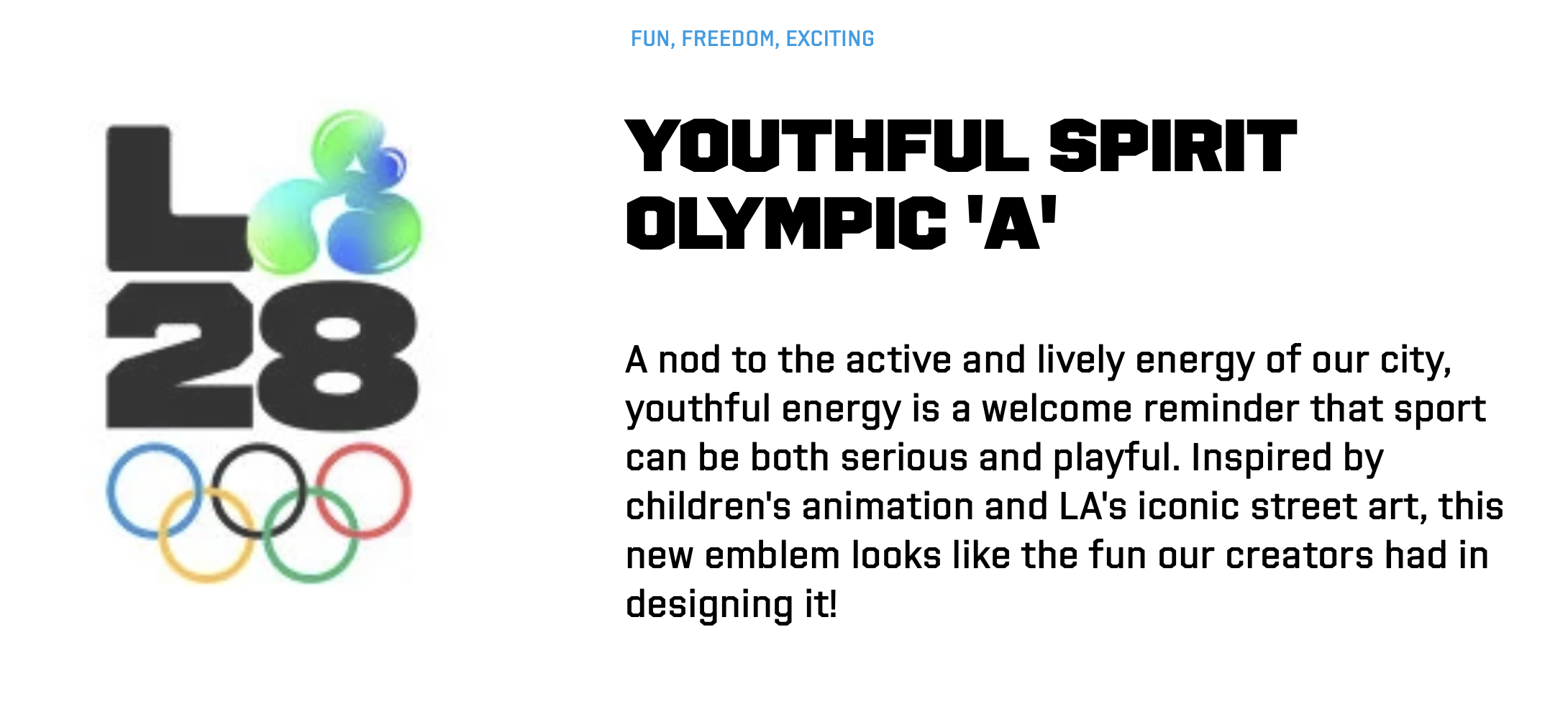
The problem is that the ever-changing 'A' means the LA28 really doesn't reproduce well. Some of the emblems barely register as a letter; much less so when rendered teeny-tiny on a screen; much, much less so when that little 'A' attempts to animate. Just look at the way LA28 chose only the street art 'A' as the website's favicon, which is a questionable choice anyway because it just looks like the anarchy symbol. (Unless that's what LA28 was going for!) But the truth is that the LA28 logo, with its amorphous 'A,' simply will not work that small.

Even when the logo is adequately sized, what is often a highly stylized, gradient-heavy 'A' becomes so visually complicated that it disappears entirely. And when you've lost the 'A' due to readability challenges, unfortunately, all you're left with are a '28' and a giant 'L.'
While I'm sharing unfortunate typography choices, I regret to inform you that the 'L,' '2,' and '8' are also three different typefaces, according to LA28. Why? There's absolutely no reason to do that when you have all this other stuff going on. So now you also have to think about that every time you see the logo — YOU'RE WELCOME!
Putting aside a series of completely baffling creative decisions here, the logo is also a liability from a strategic perspective. The fact that no one actually knows what the logo is really supposed to look like opens the door for widespread, ahem, interpretation that's going to show up everywhere from DIY signage to knockoff merch. If I made my own version and slapped it up around town, would anyone really know? The crowdsourced, create-your-own 'A' sounds very cool in theory, but I don't believe that's what the notoriously litigious LA28 wants to happen here. And what's the plan, to start carting inspectors all over the region with a 50-page style guide listing all the approved lockups to make sure all the executions are in compliance? It's a standards nightmare. Imagine describing which one you're talking about without knowing the names. I'll take that LA28 t-shirt on the left. Which one? The rainbow-barf one. No, the other rainbow-barf one.
In LA28's quest to have so many logos, now LA's games have no logo. Despite looking a little too much like a failing global telecommunications brand, the 1984 Stars in Motion logo remains enduring and recognizable, even on crumbling concrete benches. We simply won't have anything similar for 2028. "Show me the LA28 logo," I dare you to ask someone. Technically, you can't. But even this is a trick question, as LA28 has chosen to make two types of logos: one set for the Olympics that uses the rings, and one set for the Paralympics that uses the agitos. It doesn't need to be this complicated!
Which brings me to Salt Lake City's logo for the 2034 Winter Games, revealed at the end of last year, a gob-smacking 11 years out.
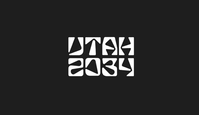
Salt Lake City — note that the logo actually says Utah 2034; all Winter Games are going regional — is doing a few things right here. First of all, the logo is only meant to be temporary. The real logo will be released in 2029. Very smart! Secondly, the logo was explicitly designed to only be rendered in high-contrast, highly readable black and white. The reason? It's for both the Olympics and the Paralympics! And universal accessibility should be the overarching priority for all games-related design, from infrastructure to infographics.
The armchair critics pounced, of course. (They always do!) But the design resonated with Danelle Umstead, a four-time Paralympian with low vision who was consulted for the concept along with other disabled athletes. "Every Olympic logo gets backlash," Umstead told the Salt Lake City Tribune. "People forget that logos aren’t created to be trendy — they're designed to be recognizable for decades, across stadiums, uniforms, merchandise, tiny smartphone screens, and global broadcasts."
I really couldn't have summed up the goals of an Olympic and Paralympic logo better than that. LA28's logo, unfortunately, in its attempt at pandering to late-stage capitalism, ends up failing at every single one. Good luck trying to explain how "every 'A' tells a story." Truly, it's time to take the L. 🔥

The official look and feel for the games shows, once again, that LA28 doesn't really understand our city

There is growing concern around the absence of a cohesive human trafficking prevention strategy for LA's megaevent era

Casey Wasserman's own company forced him out — and now LA28 really expects the city to embrace him?

"You want to present this city to the world? I'm going to film the trash and show the world how dirty we are"