A supergraphics superhero
"I liked working big and moving around. It was absolutely fearless work"

The multi-hyphenate designer Barbara Stauffacher Solomon — known to friends as Bobbie, or, in design-icon shorthand, BSS — died last week at 95. She's best known for her large-scale works of graphic design known as supergraphics, a genre she effectively invented by splaying paint across architectural elements like walls, doors, floors, sidewalks, streets, and sometimes entire buildings. Supergraphics are also essential for good wayfinding, a key tool for designers trying to help people navigate complex environments. And let's be honest — no one did it quite like BSS.
Although I wrote about Solomon's work many times, I was lucky enough to meet her once, when Aaron Rose asked me to interview her for ANP Quarterly in 2013. When I contacted her, she assumed I would be coming in person, firing off her address. Well, I can't just fly up to San Francisco to talk to her, I thought. But then I realized... I should. When I arrived at her home studio she was quite cantankerous at first and not particularly eager to speak about her work; the interview (which starts on page 68) begins with me mixing up the progression of her multidisciplinary career — I was nervous! But she warmed up quickly in what became a delightfully frank, expletive-laced conversation. "It was very kinetic," she said, when describing how she worked. "I liked working big and moving around. We'd paint stripes up that way, and then this way, and then that way. It was absolutely fearless work. It came out very easy. It still does."
When I asked to take her photo, she led me outside where she posed on a ladder leading to a roof deck, the horizontal white beams of her terrace dividing the sky into neat lines, the primary-colored triangles of sailboats drifting behind her in the bay. She lived in a supergraphic.
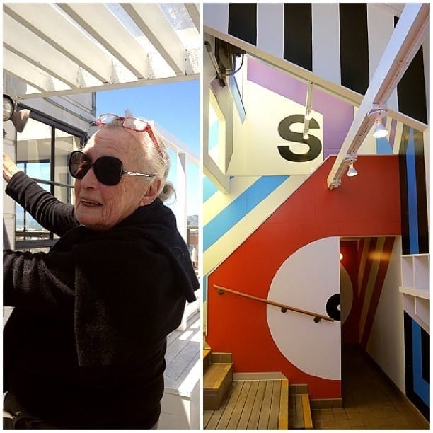
Solomon's best-known work, which you've likely seen on your Instagram grid (where I once posted the above image), will always be the Sea Ranch locker room — yes, it's a boob, as I was often reminded by my former Curbed editor Kelsey Keith, who wrote an extensive oral history on the Sea Ranch (please peruse the latest dispatch from her newsletter for all the best BSS remembrances). I love the bold stripes, but my favorite move is more quietly clever, and one she repeated in other projects: half a heart painted on a wall, which, when reflected in the adjacent mirror, makes a whole. Yet Solomon's work encompassed so much more range, including some very snazzy subway signage in New York City (a typological mystery that was solved by Amy Plitt, former editor of Curbed NY). Just this week I discovered another piece of Solomon's work I'd seen hundreds of times and never knew was her:
[Studio assistant Chris] Grunder recalls a time when Stauffacher Solomon referred, offhandedly, to her signs on Market Street in San Francisco. “Maybe you’re confused,” Grunder remembers saying to her. When did she ever get commissioned to do an installation on Market Street? So, she sent him down to Market and 3rd and had him look: “There, there,” she told him.
As it turns out, Stauffacher Solomon had designed the actual street signs. “Ta-da,” she said, when he finally made the connection.
When I heard Solomon had died, I opened up Earthquakes, Mudslides, Fires & Riots: California and Graphic Design, 1936-1986, the California design bible by Louise Sandhaus that sits on my nightstand. Sandhaus spent many hours interviewing Solomon, and as we talked about her work this week, Sandhaus reminded me of an underappreciated aspect of all those zigs and zags: Solomon created an illusion of space that didn't actually exist. "It's distorting the sense of the architecture," Sandhaus said. "You can’t quite tell what's a wall and what's a graphic."
In the book's final section, "California Girls," Sandhaus celebrates the state's women graphic designers while chronicling the sexism they faced. Trained as a dancer and also as an artist, Solomon became a designer when her first husband, the filmmaker Frank Stauffacher, died suddenly and she needed a new vocation that would financially support her family. Solomon took her young daughter to Basel, Switzerland where she was the first American admitted to study under all the Swiss modernist legends. And although Solomon stopped officially practicing graphic design — as she told me: "design is to turn shit into ice cream" — she again returned to school, and continued working as a landscape architect. "She kept climbing the ladder," Sandhaus told me. "She kept going back to school, trying to elevate her status and her legitimacy just to get recognitions for these contributions."
In many ways, the Sea Ranch project that made Solomon famous is perhaps the best example of what the design world was like for women at the time. Solomon had only been contracted to design the development's printed collateral, including the distinctive ram logo, when the architects went wildly over-budget on the swim and tennis club, leaving no money to finish the interiors. Solomon, as she describes it, was hired to clean up their mess, transforming the project in three days with a few buckets of paint. (One-Shot Lettering Enamel, she said, "the colors always pure, straight out of the can.") Sandhaus's book draws a direct line from Solomon to Deborah Sussman, the supergraphics legend who designed many elements of the 1984 Summer Olympics with similar constraints: no time, no budget, no guarantee any of it would still be around in a few months. Like Solomon's paint, Sussman created some of the most enduring supergraphic design with nothing more than cardboard tubes. As Sandhaus writes, both Solomon and Sussman "grappled with not being taken seriously" in their fields, leading them to define what was, in many ways, an entirely new one.
It's easy to enjoy Solomon's supergraphics on a purely surface level: absolutely, she was tapped to infuse what were often cold and impersonal spaces with pattern and vibrant color. But her work — like all great supergraphic work — does so much more. These immersive environments have important jobs. Anyone attempting to give people directions — ahem, LAX wayfinding designers — should be poring over Solomon's archive. She excelled at creating a sense of place; her work will always let you know exactly where you are. Just like how you always knew where you stood with BSS as well. 🔥
➡️ For another chat with BSS, read Adrian Shaughnessy's interview for his book Supergraphics — Transforming Space: Graphic Design for Walls, Buildings & Spaces
Ⓜ️ Lance Wyman's groovy wayfinding signage for the Mexico City Metro was a legacy improvement made for the 1968 Summer Olympics (he also designed the games' branding)
🌳 Did everybody watch all the Everybody's in LA episodes? During the final episode — "FUTURE OF LA" — Mayor Karen Bass called in and John Mulaney asked her what LA's policy is for replacing all these dying palm trees! She had a good answer: "We're planting trees, and we're planting grown trees, because trees take forever to grow." You heard the mayor: planting mature trees is official city policy now! But is this actually happening? Let me know if you see mature trees being planted near you
🌱 Thanks to everyone who sent me their thoughts on the ongoing conversation around planting native trees vs. planting climate-appropriate trees. I'm planning to visit the University of California’s Agriculture and Natural Resource research center in Riverside to check in on their climate-ready nursery, where scientists are testing the hardiness of a dozen native and non-native trees. I also wrote about this topic last year after a huge storm tore gaps in Sacramento's prized urban canopy

Read next

LA is not a bloomin' desert
The official look and feel for the games shows, once again, that LA28 doesn't really understand our city

When you can't find the words
When the news renders you speechless, you can always find a response that Corita already ripped from the headlines


An invasion of butterflies
"Somehow I saw in my head the sky and the ground sprinkled like confetti — sprinkled with all magical stuff that shimmered and that expressed joy"